By Riley Hill
Last Monday, candidates camped out across campus to get the best spots for their campaign posters. Nothing could be put on the walls before 8 a.m. By 9 a.m. the entire campus was covered.
Since we have to look at them for the next week, we decided to have some fun and contacted former arts representative Kelsy Norman.
During his two election campaigns, Norman turned heads with his ‘Hello Kelsy Kitty’ cut outs and clean poster designs. He also had a career in graphic design before coming to the University of Calgary, and right now, he has a rad podcast called Informal Education you should check out.
We took a walk around campus on Monday to look at the posters. Written below is Norman’s comments, which he kindly let me record.

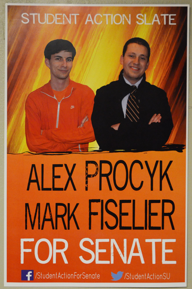
It looks like they’re burning in hell. That’s not the message I think they wanted to send to students.

This is one of the cleanest posters I’ve seen all election — simple three colours with only the necessary information.

It’s really great that he got some of the preschoolers in his family to help him with this poster, but I like the hands on approach.

Love this poster. Just clean, simple and it looks badass. Smart move saving money with the black and white.

This is my No. 1 pick. It’s well designed and he obviously put a lot of work into it. People will Google this guy.

I respect this on the level that it’s trippy. If you’re freshly blunted, you’re really going to love this poster.

This one is very professional looking. With the red and white, the message really pops out — and the KitKat’s all right.

I don’t understand this. Is he hitchhiking somewhere where they make better posters? It’s even taped poorly.